About the project
Project Goals:
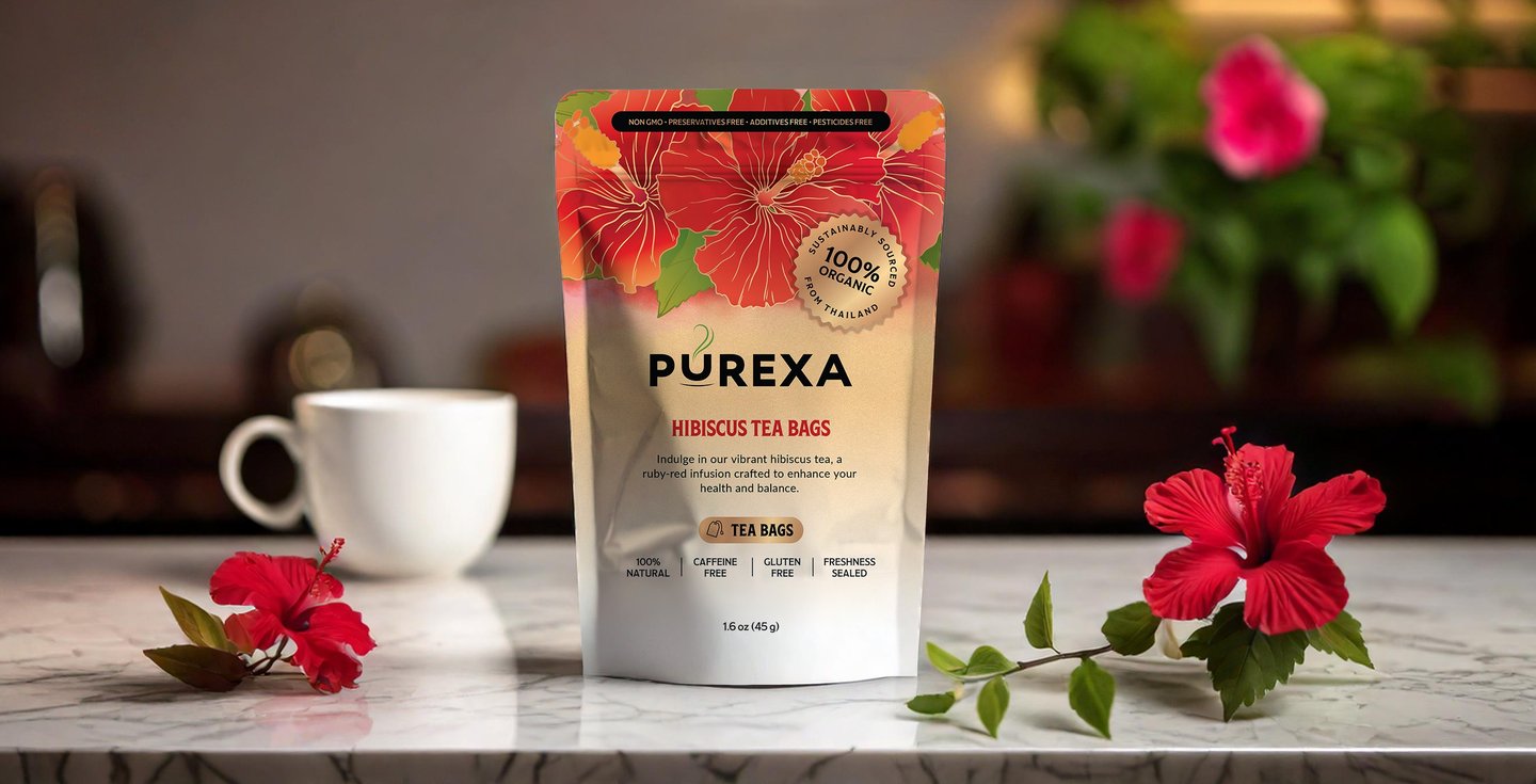
Design Purexa tea packaging that:
Appeals to health-conscious consumers by highlighting natural ingredients and health benefits.
Clearly differentiates flavors through unique visuals for each variety (Hibiscus, Soursop, Butterfly Pea Flower, and Chrysanthemum).
Communicates quality and trust by emphasizing the artisanal and natural qualities of the teas.
Builds a cohesive brand identity through consistent design language across all flavors.
Utilizes a practical and functional stand-up pouch format with a resealable zipper.
Herbal Tea Packaging
Illustration • Packaging Design
Design Decisions:
Custom Botanical Illustrations: Hand-drawn illustrations specific to each tea.
Vibrant Color Palette: Colors associated with each ingredient create visual appeal and aid flavor identification.
Clean and Informative Typography: Sans-serif fonts ensure readability and clearly communicate key attributes like "100% Natural," "Caffeine-Free," and "Gluten-Free."
Consistent Brand Elements: Overall design language create a cohesive brand identity across all flavors.