About the project
Project Goals
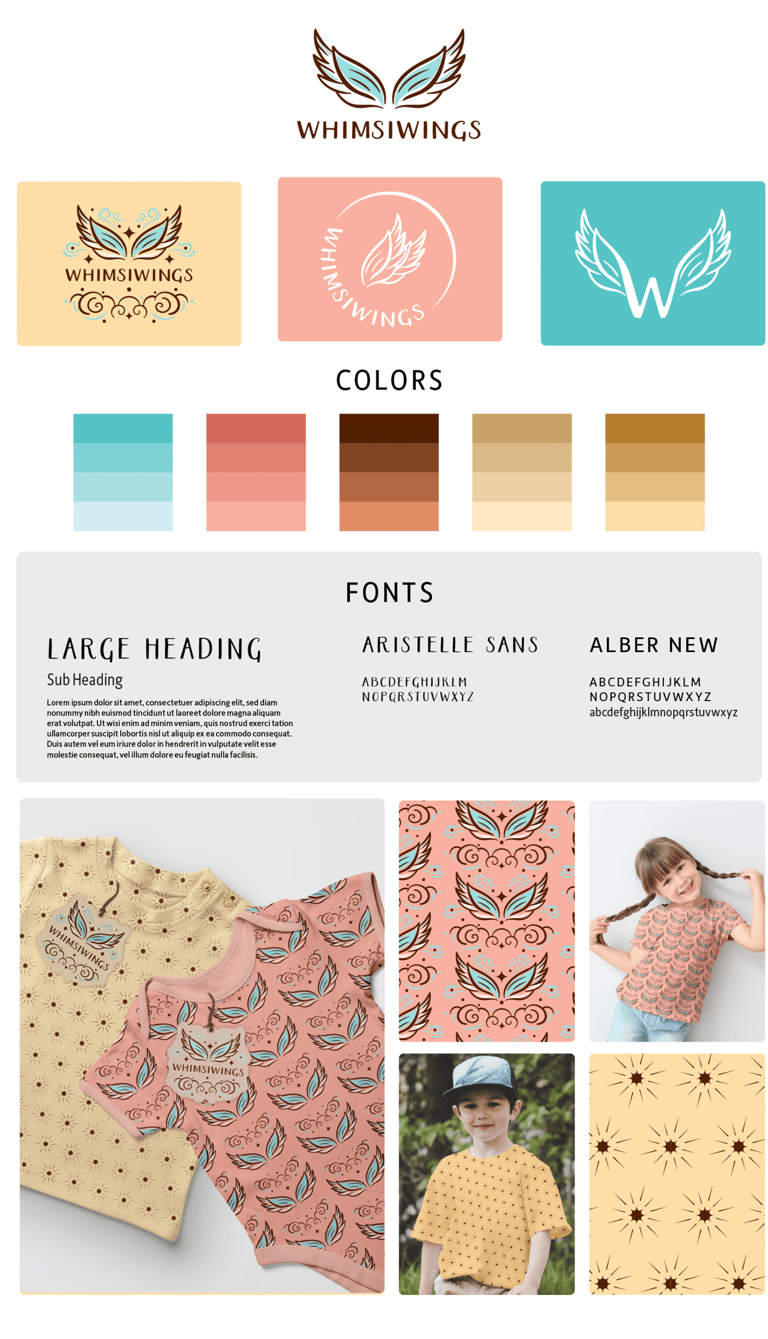
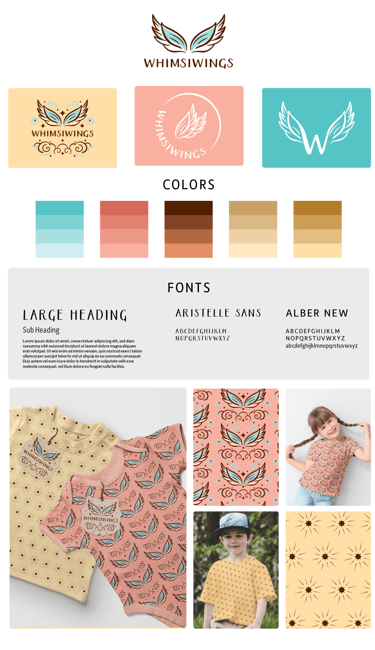
WhimsiWings was designed to be a whimsical and uplifting brand that resonates with a youthful audience while maintaining a refined, sophisticated touch. Inspired by wings and flight, the brand evokes a sense of magic, freedom, and creativity.
The goal was to craft a brand that feels both playful and polished, appealing to both children and parents. The design needed to be versatile across apparel, packaging, and marketing materials while maintaining a strong emotional connection and a timeless sense of wonder.
WhimsiWings – A Playful & Imaginative Brand Identity
Design Decisions
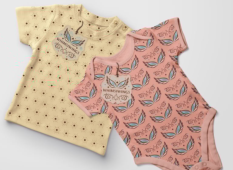
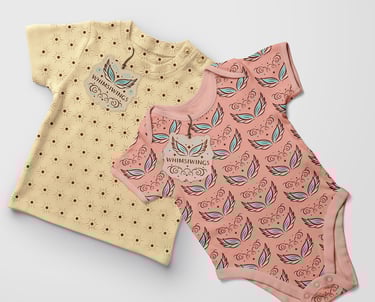
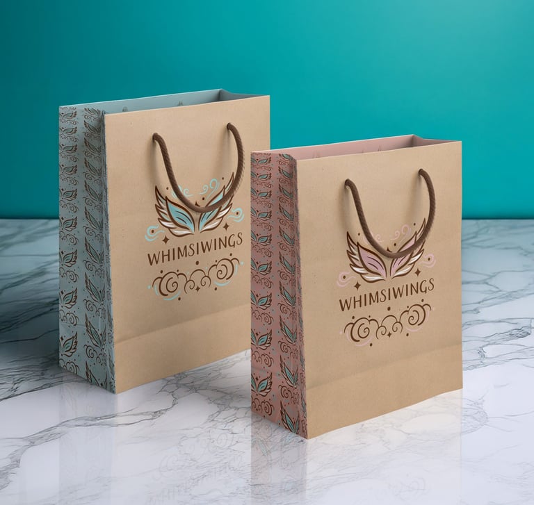
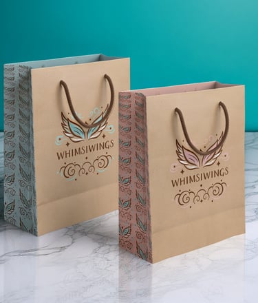
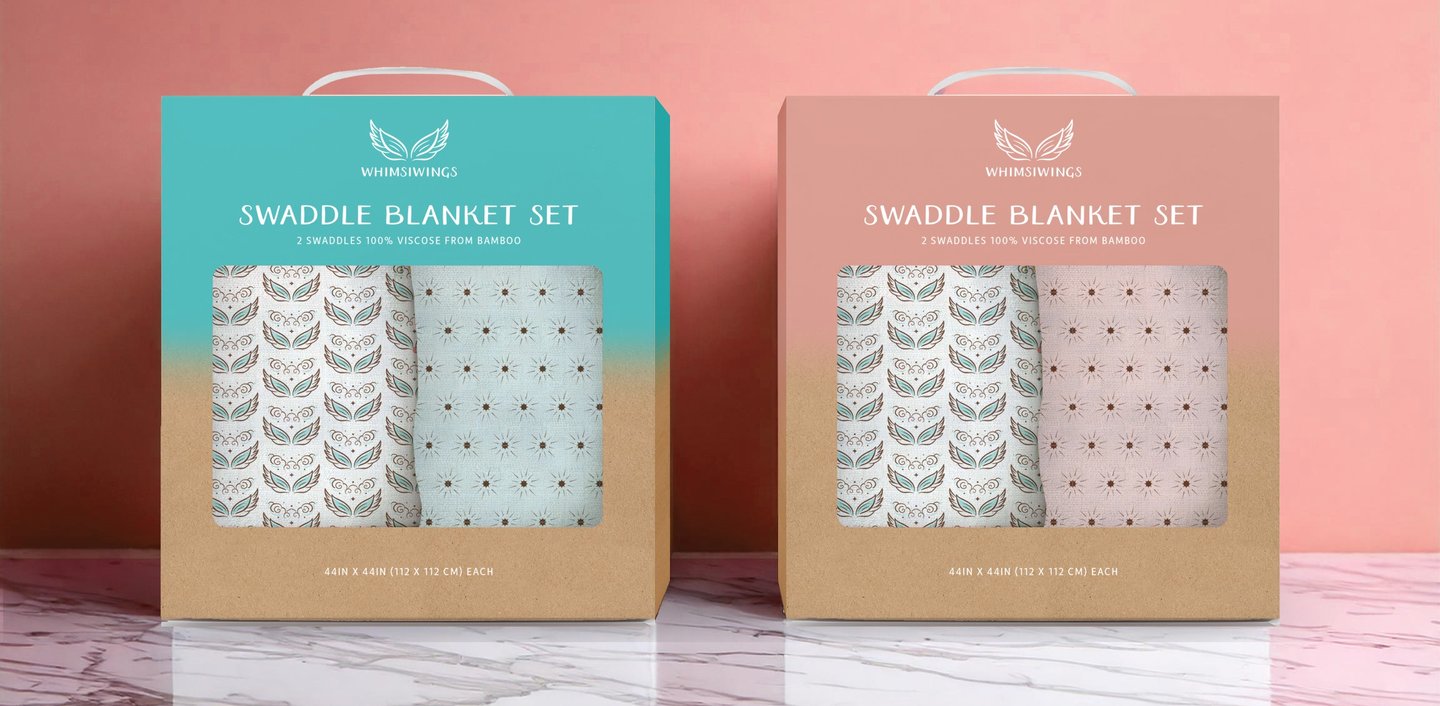
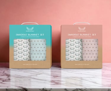
A stylized wing logo represents imagination and freedom, with variations like a monogrammed “W” for flexibility. The color palette blends soft turquoise, coral, and warm browns, creating a balance of whimsy and sophistication. Custom wing-inspired patterns add energy to apparel and packaging, while a mix of playful and structured typography enhances readability. Together, these elements form a cohesive and imaginative brand identity that feels both joyful and professional.
Logo • Branding • Marketing
Project Outcome
WhimsiWings successfully delivers a playful yet polished brand identity that seamlessly adapts across apparel, packaging, and marketing. The cohesive design system enhances brand recognition, evoking joy, imagination, and sophistication while maintaining broad appeal.